Frontline21: Field Manual
This was an 87 page field manual designed to be printed on home printers on 8.5×11” pages. It is designed to be accessible.
The brand is rough around the edges. It calls the viewer to action. This design reflects the brand, while maintaining the accessibility.
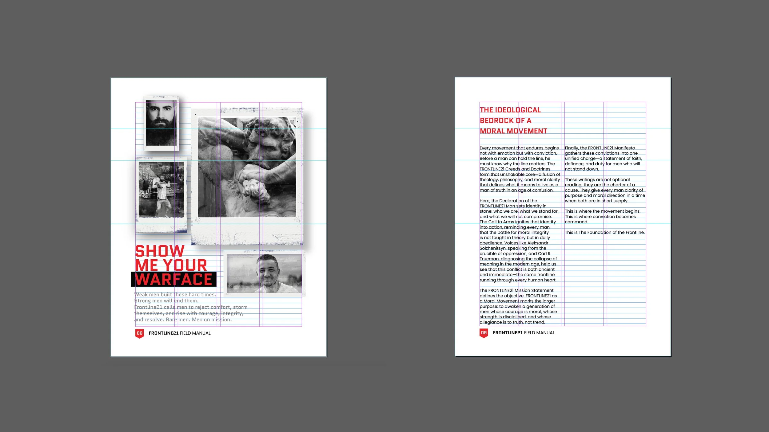
The design uses a four column grid. When the grid is broken, it is intentional and creates visual variety and interest.